The average Australian water consumption in selected cities...(Task 1 Multiple Graph Band 9 Sample)
- IELTS Luminary
- Aug 18, 2022
- 3 min read
Updated: Jun 28, 2024
You should spend about 20 minutes on this task.
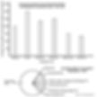
The bar chart below shows the average Australian water consumption in selected cities for last year. The pie chart shows the distribution of Australian water consumption for 2014.
Summarise the information by selecting and reporting the main features, and make comparisons where relevant.
Write at least 150 words.

Get your personalised IELTS Essay Feedback from a former examiner
Download IELTS eBooks, get everything you need to achieve a high band score
Sample Report 1
The diagram elucidates the average water consumption per household across various Australian cities for the preceding year, alongside a depiction of the country's water usage distribution for the year 2014.
A cursory observation reveals that residential water usage varies significantly among the cities, with the highest consumption reported in Perth, closely followed by Adelaide. Conversely, agricultural activities dominate the national water usage, consuming a substantial 67% of total resources.
In more granular detail, the bar chart indicates that Perth leads in residential water consumption, nearing 300 kilolitres per household per annum. With water consumption just over 250 and 240 kilolitres, Brisbane and Adelaide follow closely. In contrast, Canberra records the lowest figures, slightly over 130 kilolitres per household, while Melbourne and Sydney show more conservative numbers, with approximately 150 and 200 kilolitres, respectively, per household.
Turning to the pie chart, the allocation of water resources across different sectors in 2014 is sharply skewed towards agriculture, which consumes 67% of the water. This is in stark contrast to the relatively minimal use by households, which accounts for only 9%. Industrial sectors, including manufacturing and others, use a combined total of 10%, while utilities involved in water supply, sewage, and drainage, along with the electricity and gas supply sectors, each utilize 7%.
Download IELTS eBooks, get everything you need to achieve a high band score
Sample Report 2
The provided visuals delineate the mean annual water usage in kilolitres per household for several major cities across Australia over the past year and illustrate the breakdown of national water consumption for 2014.
Initially, an examination of the data reveals two prominent observations: the disparity in water use among the cities and the predominance of agricultural consumption on a national scale. The bar chart shows that residential water use is considerably variable, with Perth recording the highest figures.
Delving into specifics, the bar chart illustrates that Perth's average water consumption towers at approximately 300 kilolitres per household annually, making it the city with the most substantial water usage. Brisbane and Adelaide also exhibit high consumption levels, both exceeding 230 kilolitres per household. On the other end of the spectrum, Canberra shows the least consumption, barely surpassing 130 kilolitres, with Melbourne and Sydney also maintaining lower usage levels about 150 and 200 kilolitres, respectively, per household.
Focusing on the pie chart, a stark dominance by the agricultural sector is evident, accounting for 67% of total water consumption in 2014. Residential use comprises a mere 9%, highlighting the minimal comparative impact of household consumption. Industrial sectors together consume 10%, split among mining, manufacturing and others. The utilities sector, including water supply, sewage, and drainage, as well as the electricity and gas supply sectors, are responsible for 14% of the water use, each constituting 7%.
Sample Report 3
The bar diagram illustrates the annual average water consumption by the six major Australian cities in 2014, while the pie chart demonstrates the percentage share of water usage among seven sectors in the same period.
Overall, Perth and Canberra, respectively, registered the highest and the lowest use of water among the given six cities. As far as the sector wise distribution of water is concerned, the overwhelming proportion was used in agriculture, while the least went for the mining sector.
The city of Perth had the highest yearly average water use, at 300 kilolitres per property, followed by Brisbane and Adelaide, at 250 and 240 kilolitres, respectively. However, Sydney’s use was precisely 200 kilolitres while Canberra was the lowest with only 130 kilolitres of water usage which was just below the level of Melbourne (about 150 kilolitres).
On the other hand, in 2014, the agriculture industry accounted for more than two thirds (67%) of Australian water consumption, while the combined amounts of water supply, sewage and drainage, electricity and gas supply made up 14% of the total. Housing took up the most space (9%) among the remaining six categories, followed by manufacturing and other industries at 4% each. However, mining was the sector that used the least water in 2014, accounting for only 2% of total consumption.
Get your personalised IELTS Essay Feedback from a former examiner
Download IELTS eBooks, get everything you need to achieve a high band score
